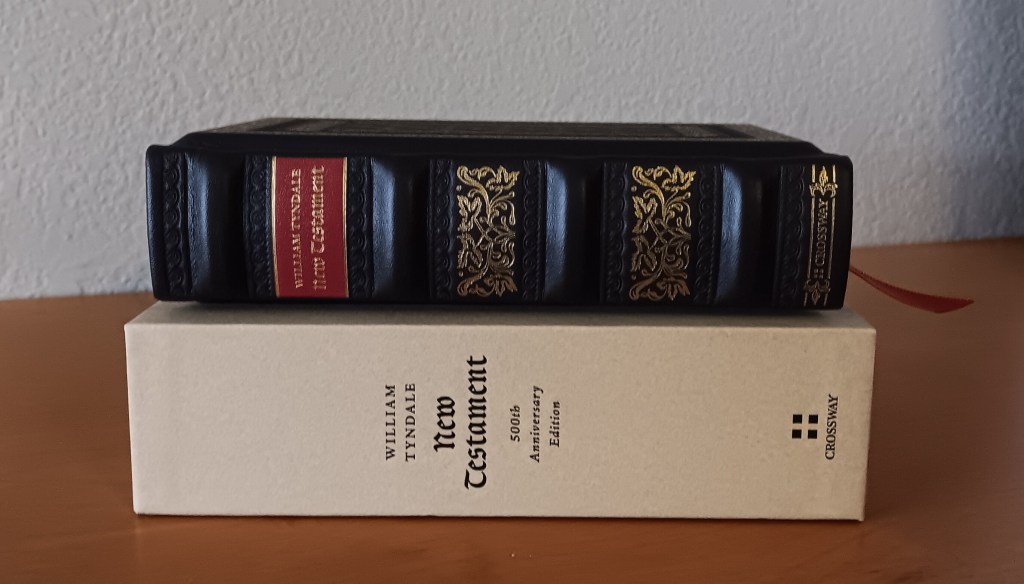
William Tyndale’s work is the underlying basis for many English translations that came later, most notably the Geneva Bible and the King James Bible. Both draw heavily on his work. Tyndale was the first person to translate the Greek New Testament into English, and he produced at least two editions during his lifetime: the 1526 New Testament and the 1534 edition.
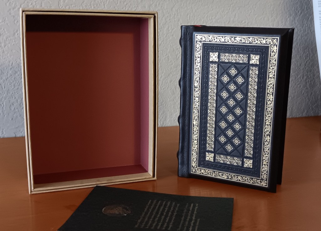
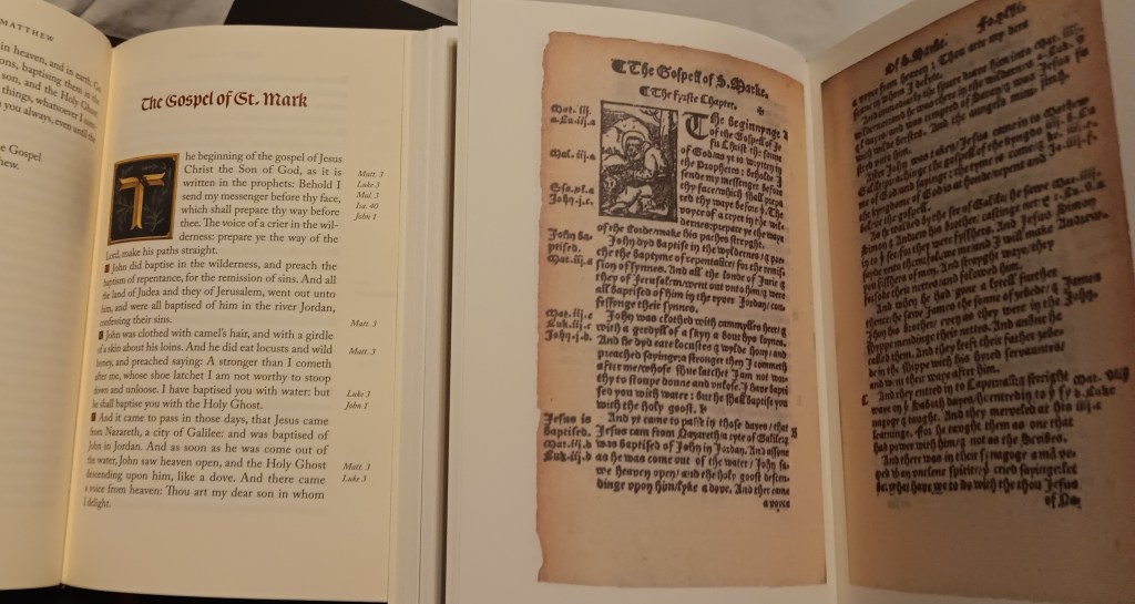
This year marks the 500th anniversary of the 1526 edition and this edition from Crossway pays homage to William Tyndale’s translation work. While it uses the 1534 text, Crossway patterned the layout after the 1526 edition.
The Text and Translation
The text has been taken from the Tyndale Society, and from what I’ve read so far, it reads accurately to Tyndale’s 1534 edition. Some of the original extra material has been left out, such as the prologues to each book, the margin notes, and information in the back matter. It does contain Tyndale’s original Introductions to the Reader.
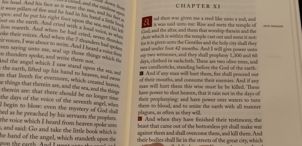
One standout is how numbers are handled throughout the text. Where modern English might spell out a number, this edition often uses the numeral itself, as in 24 elders, 7 trumpets, or 4 angels. Some readers may find this a little off-putting, but to me, it shows the Tyndale Society’s dedication to preserving the feel of the original.
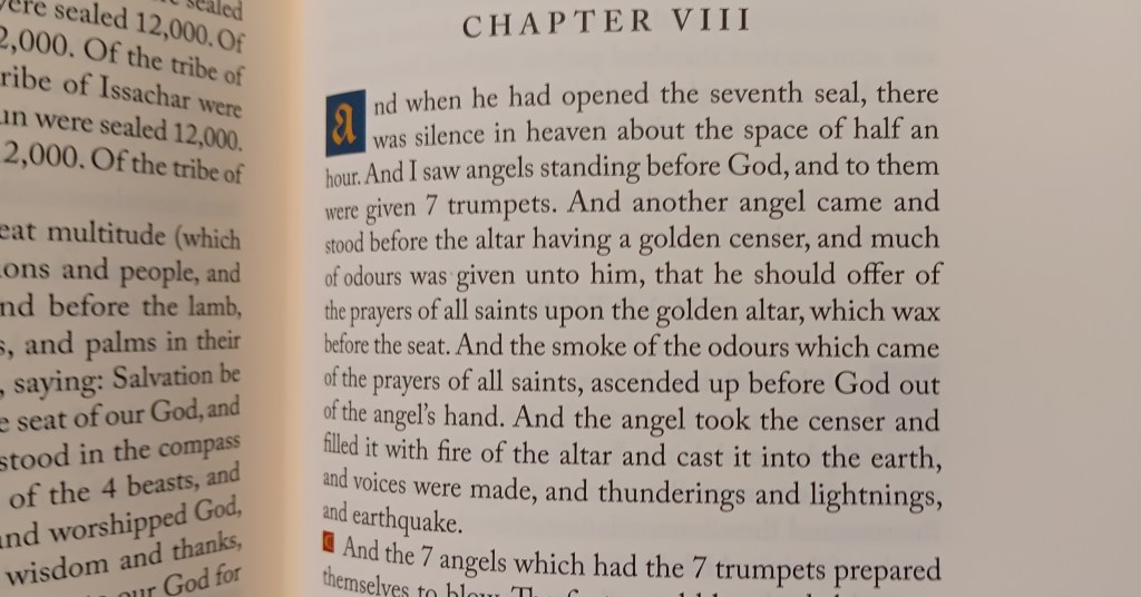
The spelling has been updated to modern spelling, while archaic words have been retained, with modern definitions provided in the outer margins.
Layout and Decorative Details
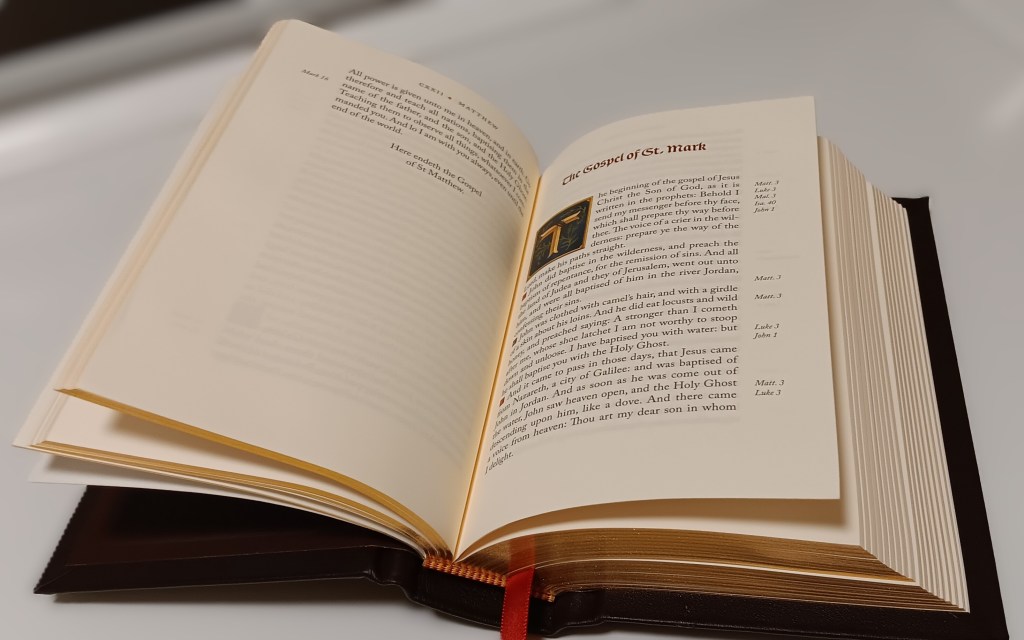
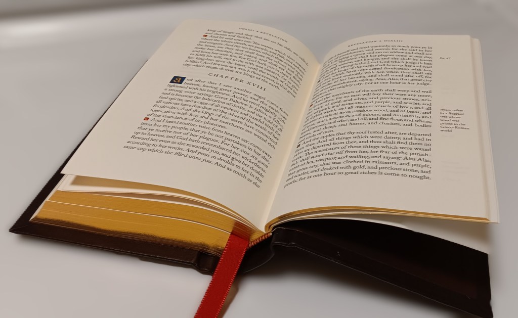
The layout uses a single column set in a paragraph format. The text is black letter only with no verse numbers or subject headings. Cross-references are limited and appear in the outer margins. At the top of each page, you’ll find the book title and page number. The page numbers are in Roman numerals, so you may have to brush up on those.
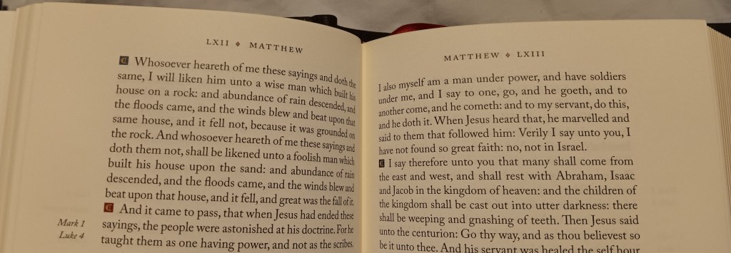
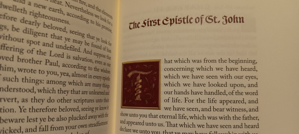
Each book opens with a large drop cap that covers seven lines of text. Each drop cap has been specially designed to represent its book, so each one has a different design. The drop caps are either printed in blue or red, and there is a list of descriptions giving the meaning of these drop caps at the back of the Bible.
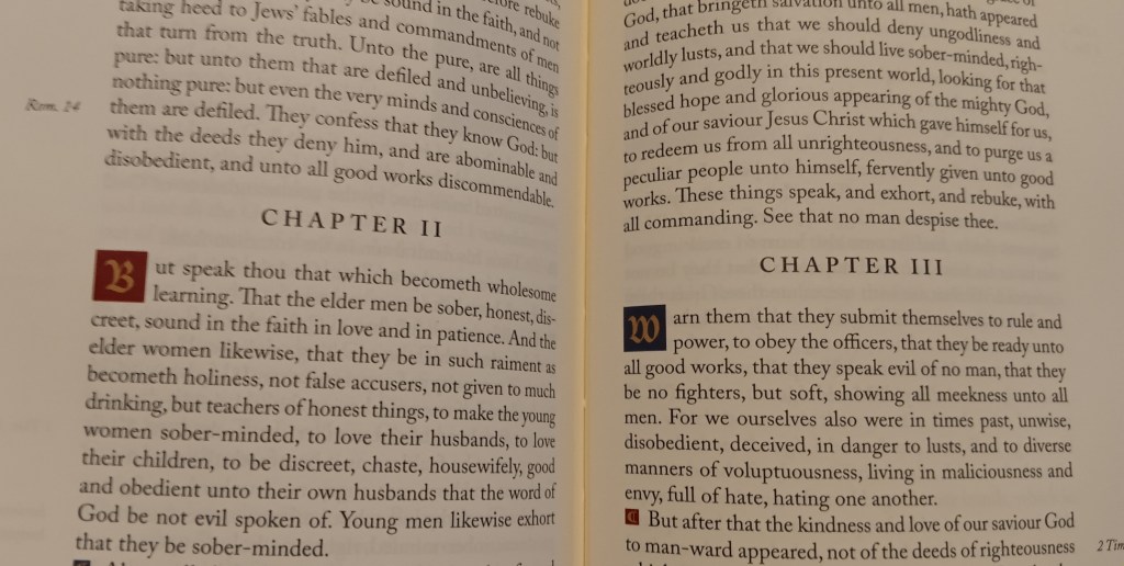
Chapters are designated by Roman numerals. Each chapter starts with a smaller drop cap covering two lines of text and are set in a red or blue box with the first letter printed in gold.
Decorative pilcrows mark the paragraphs, these cover just one line of text and like the chapter drop caps, they alternate between red and blue with the pilcrows printed in gold. All these colors work very well with the paper, and the printing is consistent throughout.
Font Size and Readability
The main text is listed as 9.5-point Caslon Pro, but it reads smaller to me. Although the uppercase letters measure 9.5 points, the lowercase letters measure smaller. I think a font with less difference between the uppercase and lowercase letters would have read closer to 9-point type. As it stands, this reads closer to 8-point type.
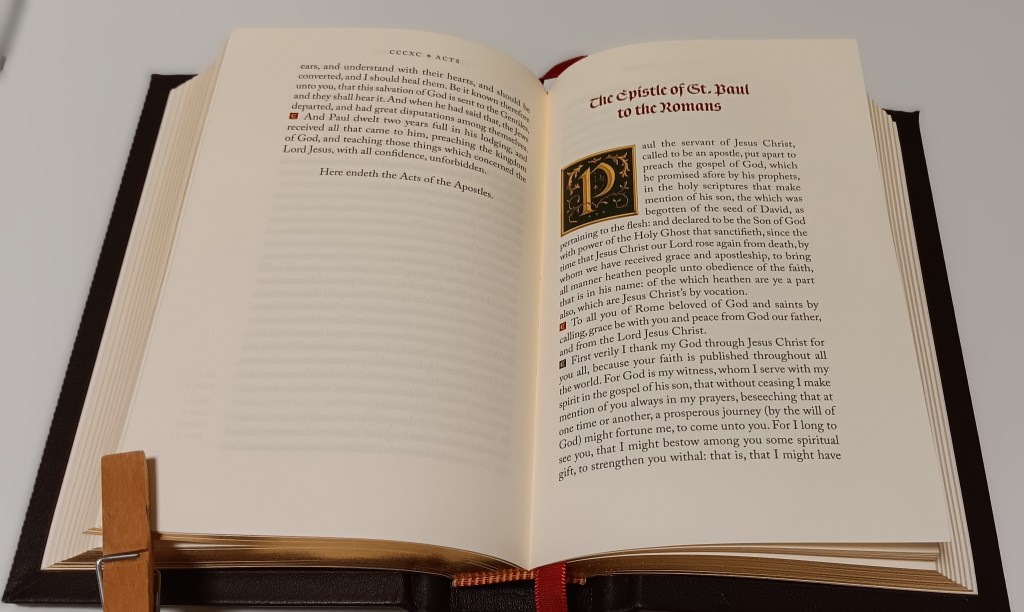
Maybe Crossway could produce a larger edition with larger print for those of us who need it, please?
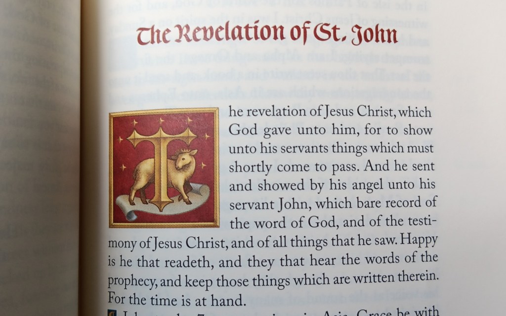
The leading, or spacing between the lines of text, measures around 9 points. The larger antique font used for the book titles is “Burgundica”, printed in dark red and measuring about 14 points. The references and definitions in the outer margins measure around 6–7 points.
Paper Quality
The paper is perfect for this edition. The show-through or ghosting is minimal. You can see some print from the other side of the page, but it is not at all distracting. The paper has a beige appearance, which for me, suits this edition perfectly.
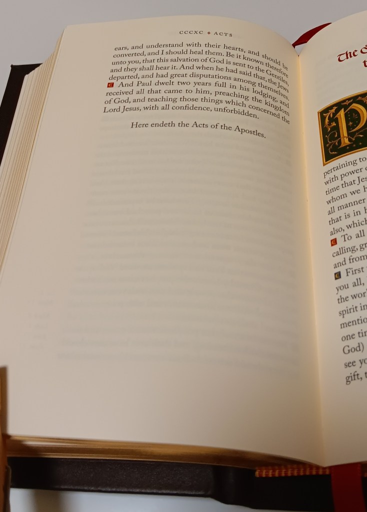
It feels premium and smooth, yet stiff enough to resist those unwanted creases that plague traditional Bible paper. The paper is listed at 70 gsm, and I measure its thickness at 10 mm, or .39 inches, for 300 pages. For comparison, 45 gsm paper measures 6 mm, or .25 inches, for 300 pages.
Leather Binding and Construction
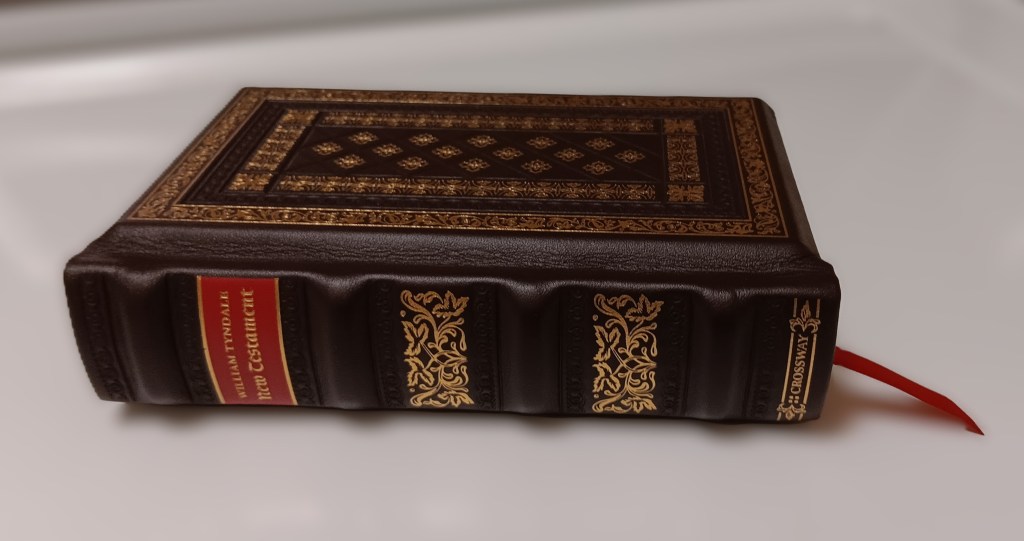
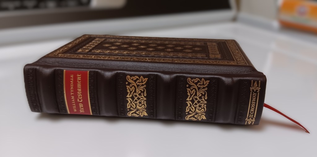
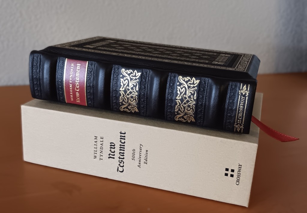
This is the leather-over-board edition. The leather is dark brown, like a dark chocolate brown. It is very decorative and the front and back boards have mitered or chamfered edges. The boards are thick, measuring about 5/16 of an inch and the spine has 4 raised hubs.
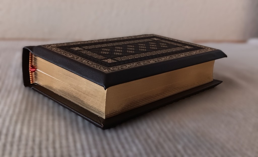
It’s hard to describe the feel of the genuine leather because it is glued over hard boards, but to me, it feels like cowhide or calfskin. At the hinges between the spine and the front and back boards, where there is only leather, it feels soft. That softness is less noticeable over the hard boards.
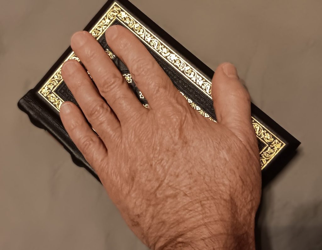
This edition is about the same size as my hand and the outer dimensions: 7 × 4-3/4 × 1-3/4 inches, and the Inner dimensions: 6-3/8 × 4-1/4 × 1-1/4 inches.
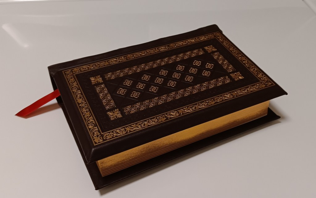
The front and back covers have a crosshatch pattern deeply embossed into the leather. A decorative gold border frames the crosshatched area. The gold stamping is even but light, so I’m unsure how long it will remain over time with repeated use. Outside there is a blind-stamped border, followed by another gold-stamped border, and the decorations use a variety of patterns and designs.
The hubs are raised, and when I say raised, I mean these are like traffic speed humps, but on the spine. Between the top two hubs is a red banner trimmed in gold with the words “William Tyndale” and “New Testament” underneath. Between the other hubs are decorative gold vines, and the hubs themselves have decorative tooling.
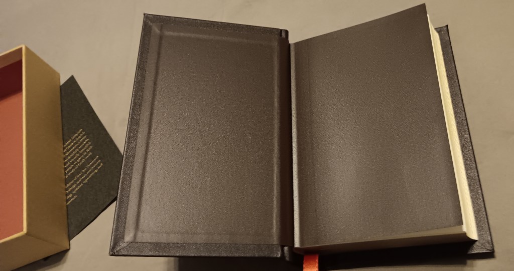
The end sheets and liners are made of dark brown vinyl. There are a few blank sheets between the end sheets and the text: four at the front and six at the back, to be precise. The head and tail bands are red and yellow, with a single matching reddish ribbon. The gold page edges have been applied evenly.
A Few Thoughts on Tyndale
There’s not much I can say about William Tyndale that hasn’t been written elsewhere. By Protestant accounts, he is regarded as a martyr and hero, while his Catholic opponents regarded him as a heretic. One explanation says he was killed because he translated the Bible into English and another says he was killed because he was considered a false teacher. Based on what I’ve read about Tyndale, including passages from Tyndale himself, I’d say both explanations are true to an extent.
Tyndale translated the Bible without permission, but he also wrote books and other materials criticizing certain teachings and practices of the Catholic Church. He was labeled a heretic, stood trial for heresy, and was put to death by strangulation, after which his body was burned. In my view, his translation work, religious disputes, and politics all played a role.
These were very serious matters at the time, and I don’t think Tyndale misunderstood the consequences. What Tyndale did was for the benefit of everyone, and his work gave us much of what later became the King James translation.
When you think about Tyndale’s influence, there are connections to the Protestant movement in England, changes in government, Shakespeare, the Puritans and Pilgrims, and a legacy that reaches into the establishment of colonies in America and the government that followed.
I would recommend that every Christian own a copy of Tyndale’s translation, not only for its historical importance, but also in consideration of Tyndale’s sacrifice and the influence his work has had over the past 500 years.
Final Thoughts
My gripes or critiques would be that the text is set closer to the gutter than I would like. There is plenty of room to move the text further away from the gutter, so I’m unsure why it wasn’t. I also had a hard time getting this Bible to stay open and lie flat. The front and back boards will lie flat, but the block itself, or the stiffness of the paper keeps it from lying flat. Maybe if it had been a larger Bible, the paper might have been more flexible? And, as I mentioned earlier a larger print edition would be much appreciated.
Overall, I think Crossway has done an excellent job with the design and construction of this edition. I look forward to seeing how it holds up and ages. It’s a beautiful edition and a nice nod to William Tyndale and his translation work. As a fan of Tyndale and his work, my thanks to Crossway for the effort they put into this project.
This design is also available in the English Standard Version. I ordered one, but for some reason it did not ship. There are four editions in all: leather overboard and imitation leather, available in either the ESV or Tyndale’s translation.
*I have no affiliation with Crossway Publishing or the Tyndale Society, all comments are my own.


Leave a Reply