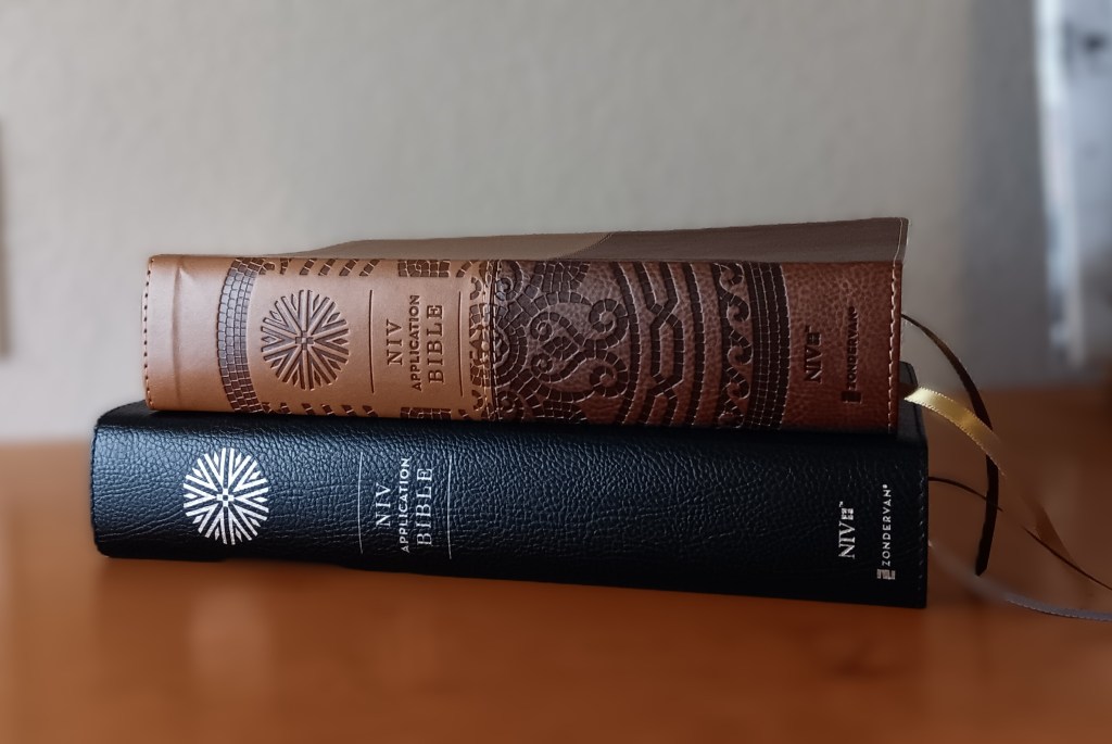
A review of the large-print and regular-print editions
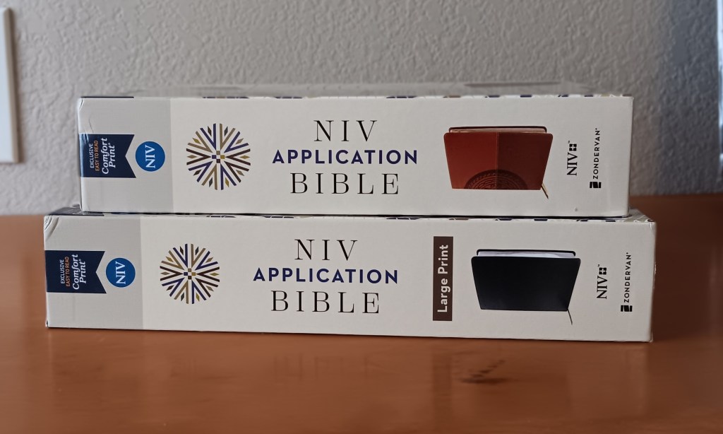
Overview and Layout
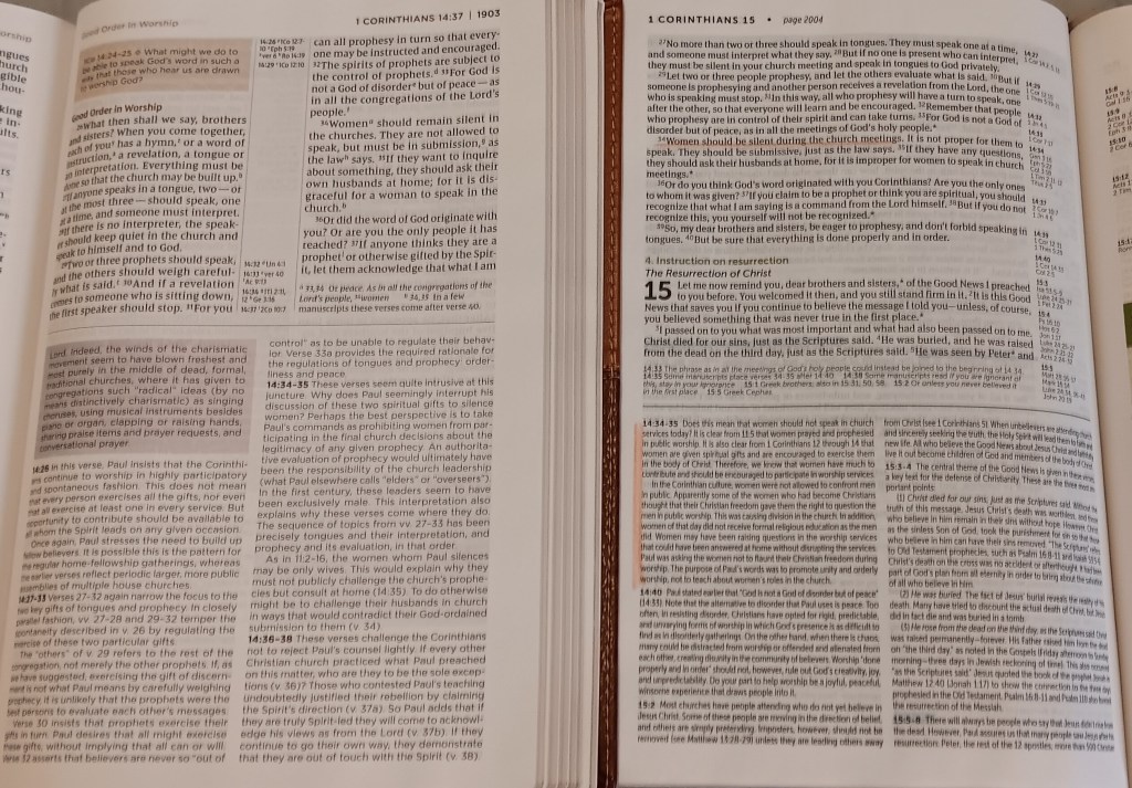
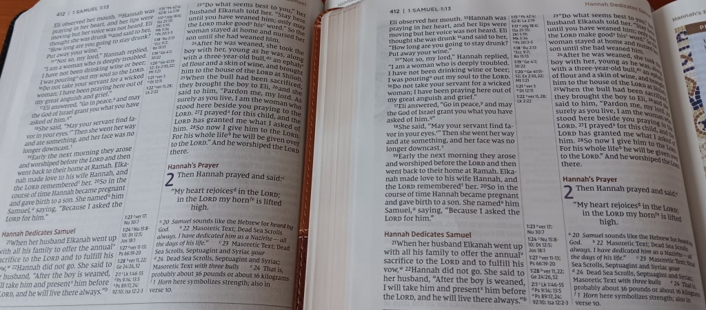
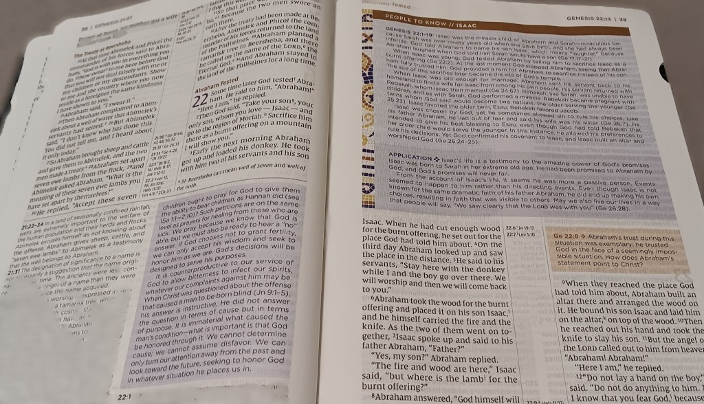
Although it should not be confused with Tyndale Publishers’ Life Application Study Bible, the Zondervan Application edition follows a similar concept. The most noticeable differences are its design and text layout. It uses a two-column, paragraph-style format with center-column references.
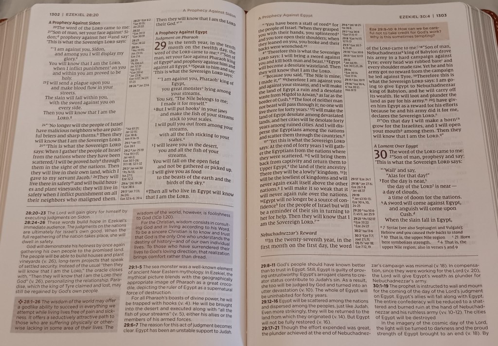
Textual notes appear at the bottom of the right-hand text columns, while study notes occupy a separate area at the bottom of the page. A dividing line separates them from the biblical text. Application notes appear in lavender-shaded boxes, and application questions appear in tan-shaded boxes. The graphics, colors, and printing work together to create an attractive layout that draws you further into the text.
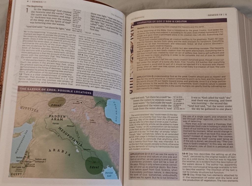
The purpose of this edition is to help readers understand the Bible in its original context, recognize that it was written for an ancient audience, and apply its meaning to a contemporary audience. It accomplishes this through book introductions, articles, maps, charts, timelines, and several types of notes, including notes on original meaning, application, and application questions. The introductions and notes are drawn primarily from a much larger source: the one-volume Life Application Commentary on the Bible, which is based on a 44-volume commentary set.
Book Introductions and Study Content
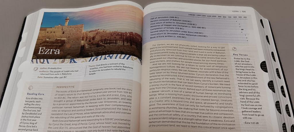
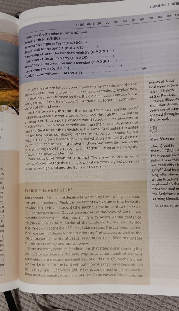
Each book of the Bible begins with an introduction that provides key information, including the author, audience, date, and theme. A section called “Perspective” follows, explaining the book’s message for modern readers, along with a historical timeline and reading guide. A brief “Taking the Next Steps” section then summarizes important themes and details. The “Perspective” section appears in a light tan-shaded box, while “Taking the Next Steps” appears in a slightly darker tan-shaded box.
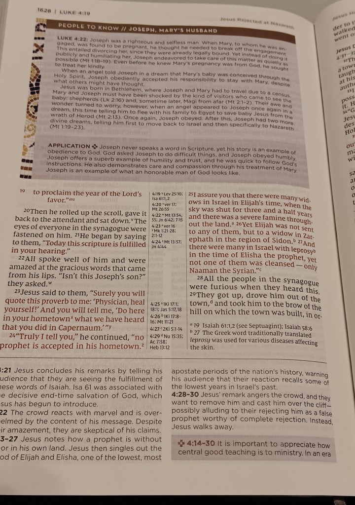
The edition includes more than 200 articles: there are 150 “People to Know” character profiles and 52 “Character of God” articles. Each article concludes with an application section designed to help you better identify with the material. Written by prominent biblical scholars, the articles and notes are placed throughout the Bible where they are most relevant. The “People to Know” articles profile prominent biblical figures and appear in lavender-shaded boxes, with their “Application” sections in a slightly darker lavender. The “Character of God” articles appear in tan-shaded boxes, with their “Application” sections in a slightly darker tan.
Paper, Printing, and Margins
The eggshell-white paper has little, if any, sheen. I find that the paper in the large print is a whiter shade than the regular print. Comparing them side by side the paper in the regular print edition looks slightly more cream in tint. I am unsure of its exact opacity, but I estimate its weight at approximately 38 gsm because it measures thicker than 36 gsm paper.
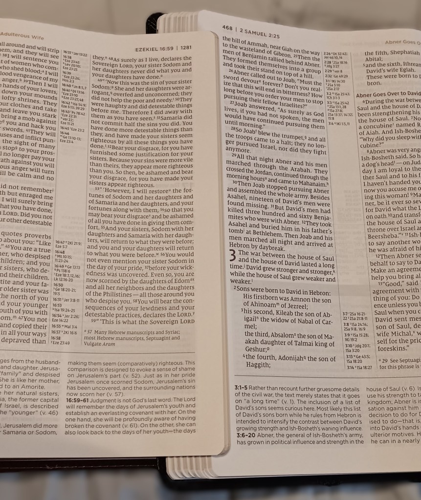
This is a full-color edition. The main text is black, the words of Christ are red, and purple, brown, and gold serve as accent colors. The verse numbers and subject headings are printed in dark purple. Some print show-through is visible from the reverse side, though I do not find it overly distracting. Overall, the darkness of the printing is fairly consistent, although there is some slight variation between the two editions.
The outer, inner, top, and bottom margins measure approximately 5/8 inch, which is slightly better than average, although I would still appreciate additional space.
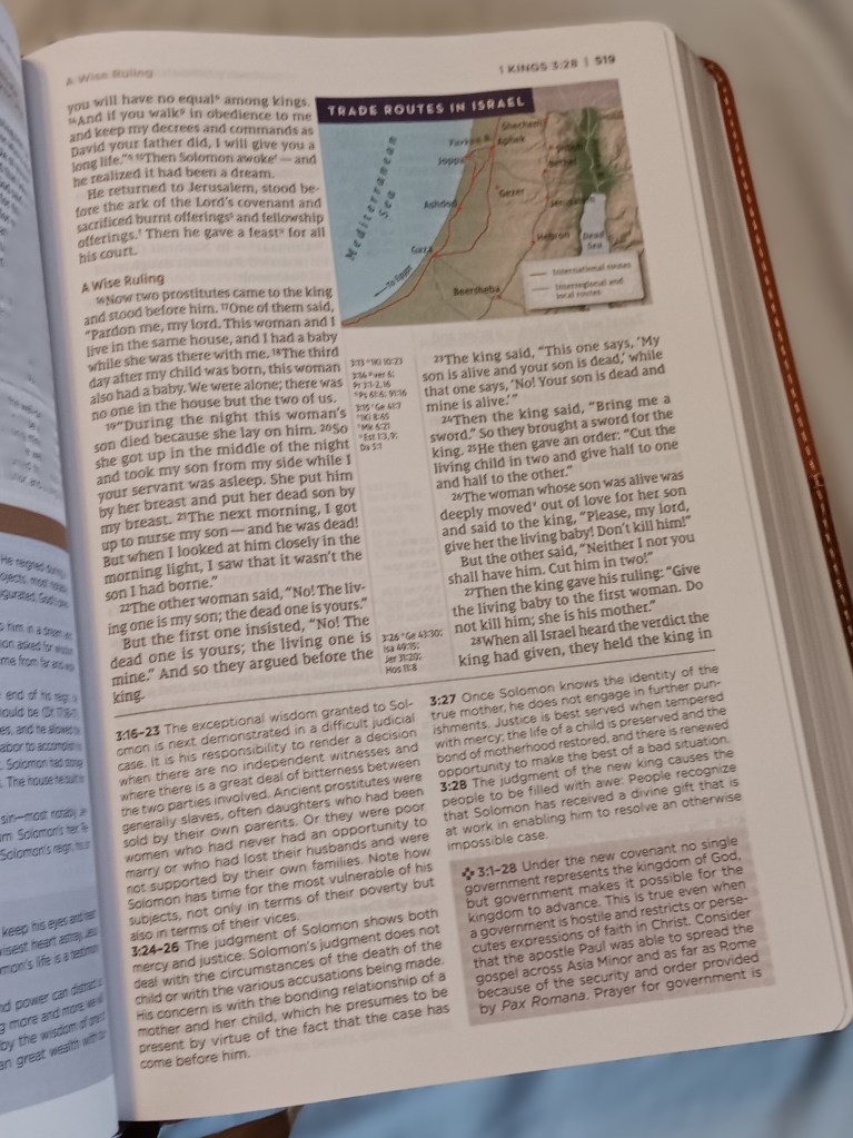
Although I am not a note-taker, I prefer generous margins. A Bible should have a beautiful open presentation rather than a cluttered mass of text, and wider margins provide more room for occasional notes.
Study Notes and Commentary
The Zondervan Application Bible appears to contain fewer study notes than Tyndale’s Life Application Study Bible, I would say conservatively about one-third less. Readers who want a greater quantity of notes may prefer the Tyndale edition. However, fewer notes can sometimes be less distracting, and Zondervan seems to aim for a more concise view of Scripture. So, readers seeking a less complex study experience may prefer the Zondervan edition. Something to keep in mind, the Zondervan App regular edition has larger print than the Tyndale App regular print size edition, with that said the Tyndale edition has 200 more pages. Personally, I appreciate the layout and the content of study material in both editions.
Large-Print and Regular-Print Editions
The large-print edition uses the same layout and pagination as the regular-print edition, but its overall dimensions are larger. At 2242 pages it measures approximately 10.5 × 7.25 × 2 inches. The book is heavy and somewhat cumbersome, making it better suited for home or office use, but I find the larger print clear and comfortable to read.
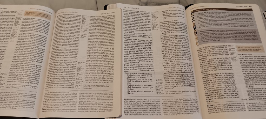
The regular-print edition measures approximately 9.5 × 6.5 × 2 inches. Its text is about 9 pt, and its notes are about 7.5 pt. The large-print edition uses approximately 10.5 pt text and 8.5 pt notes. Readers who do not need larger print may find the regular edition more convenient, while those who prefer a clearer and more open page or a little more white space, will likely appreciate the large-print edition.
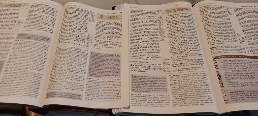
Note: I measured the type sizes myself. They may differ slightly from the advertised specifications, but I have tried to be as accurate as possible.
Front Matter and Study Aids
The front matter includes the NIV Application Bible Preface, the NIV Application Bible Introduction, information about the free downloadable mobile app, the NIV Translation Preface, an introduction to the one-volume NIV Application Commentary on the Bible, and an Old Testament chronology.
The study aids in the back include the following:
- Table of Weights and Measures
- “Character of God” and “People to Know” indexes
- Lists of maps, charts, and contributors
- Reading plans
- Dictionary/concordance
- Index to maps
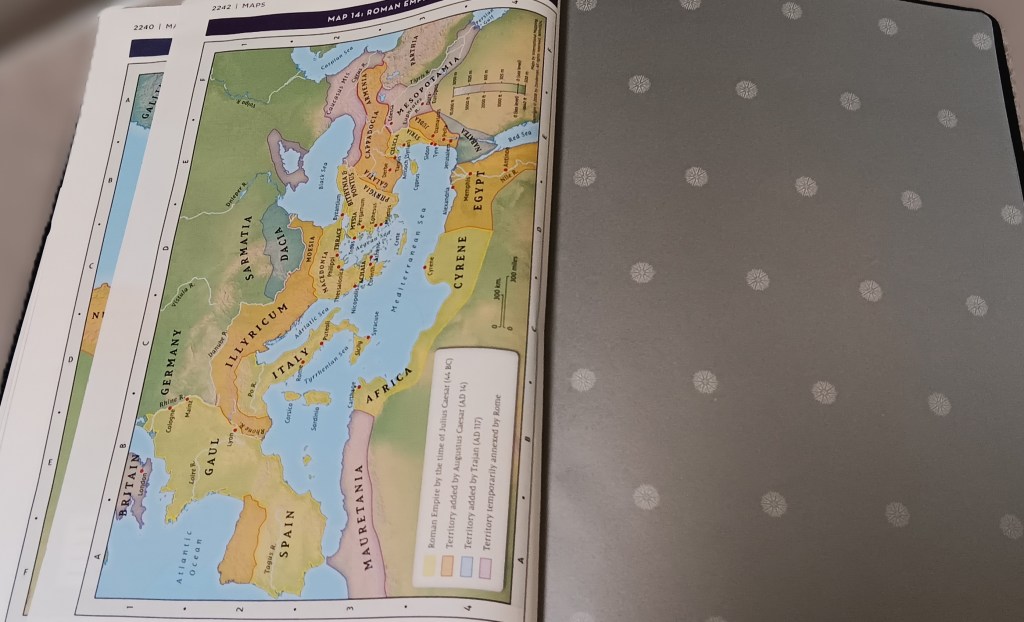
- Fourteen full-color NIV maps printed on regular Bible paper
Binding and Construction
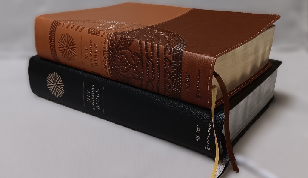
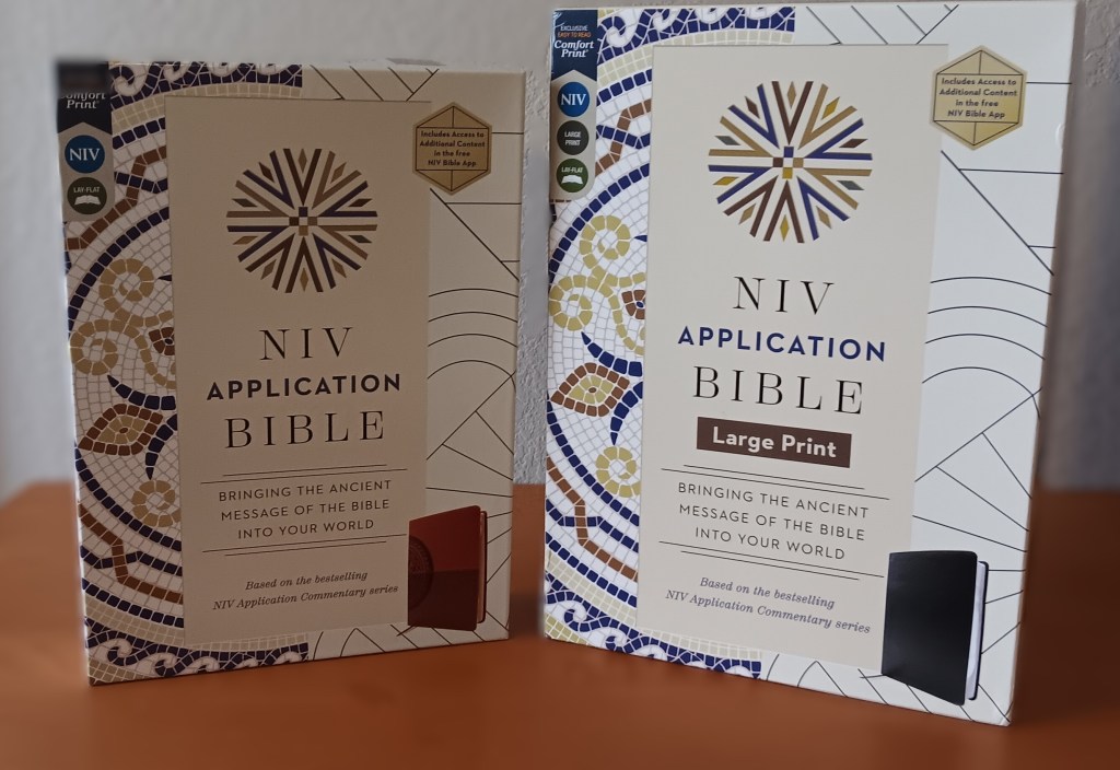
The Bible uses a paste-down binding with paper liners and end sheets, and the text block is Smyth-sewn. The large-print edition has a perimeter-stitched black bonded-leather cover. The regular edition has a perimeter-stitched, two-tone brown Leathersoft cover. There are two bible ribbons in two different colors. The ribbons are thin and cut to an acceptable length, and they are spaced apart well. The page edges are silver for the Large Print and gold for the Regular edition, and the silver and gold are applied evenly with no issues.
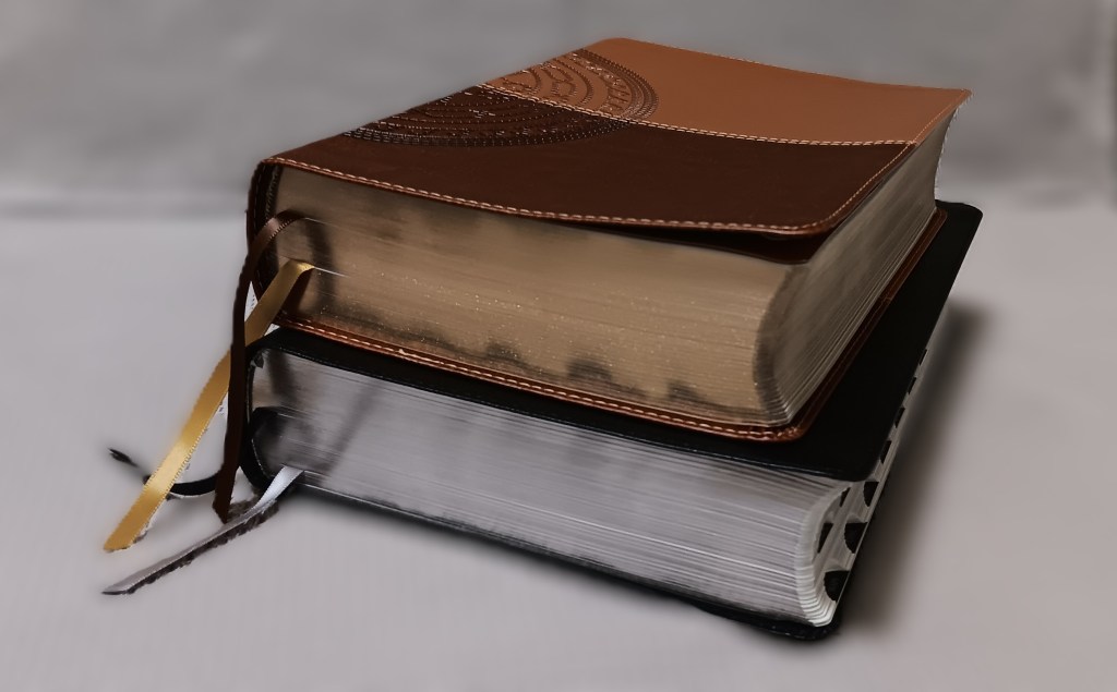
Overall, the construction is well executed, however I would prefer additional end pages made from heavier paper. Each edition has one end page at the front and back before transitioning directly to Bible paper. This makes the first and last pages pull in considerably when opening. The 14 colored Bible maps in the back are printed on the same Bible paper.
The large-print edition lies somewhat flatter out of the box, while the regular edition may require more use before it lies completely flat.
Commentary Scope
The Zondervan Application Bible draws from a one-volume commentary that was itself based on a 44-volume set. According to Zondervan, the complete 44-volume set contains more than 90 million words, while the one-volume edition contains more than 1 million. The study system in this Bible is said to contain approximately 600,000 words. Of course, you could always purchase the Bible and the single column Commentary and use them together.
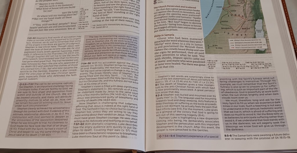
It is important to remember that the notes and introductory material are commentary, not part of the biblical text, and should not be given the same weight. These study aids can help readers understand, navigate, and apply Scripture, but on occasion can be more speculative.
Final Thoughts
There is little here to criticize: 1) The Dictionary/Concordance isn’t very extensive, since it contains only 40 pages and two columns of entries per page when most study Bibles have twice as many entries. 2) Currently the NIV Application Bible is only available in the NIV, so eventually I would like to see this study Bible offered in additional translations, such as the NASB and KJV. 3) Wider margins and additional end sheets at the front and back would be some welcome improvements. 4) Currently the bonded leather is the best binding offered in the large print edition, so I would like to see a more premium binding made available.
Overall, both editions are attractive, readable, and thoughtfully designed.
Both editions can be purchased online here:
Regular Print Edition: Christian Book Distributors
Large Print Indexed Edition: Christian Book Distributors


Leave a Reply