The text of the Reader’s edition is the King James Translation and utilizes a special formatting system called Sacred Syntax.
Sacred Syntax enhances the text’s appearance by varying the alignment and adjusting indentation based on the type of content, such as parables, poetry, prayers, lists, dreams, and visions.
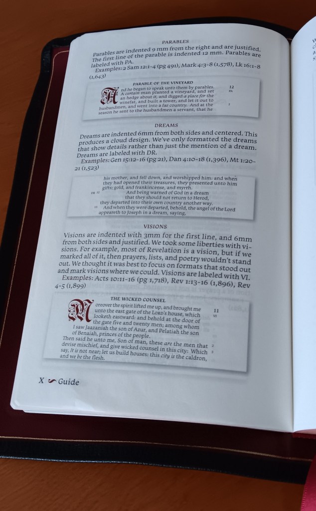
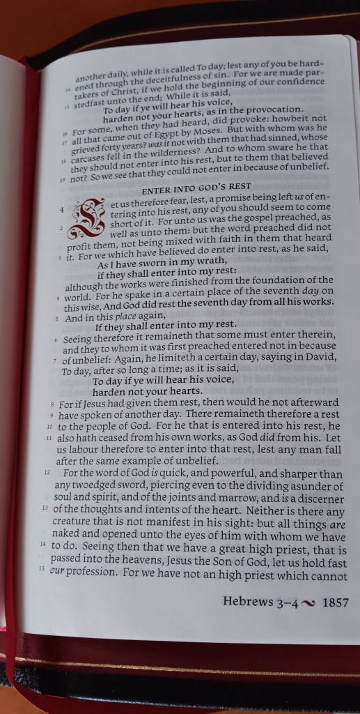
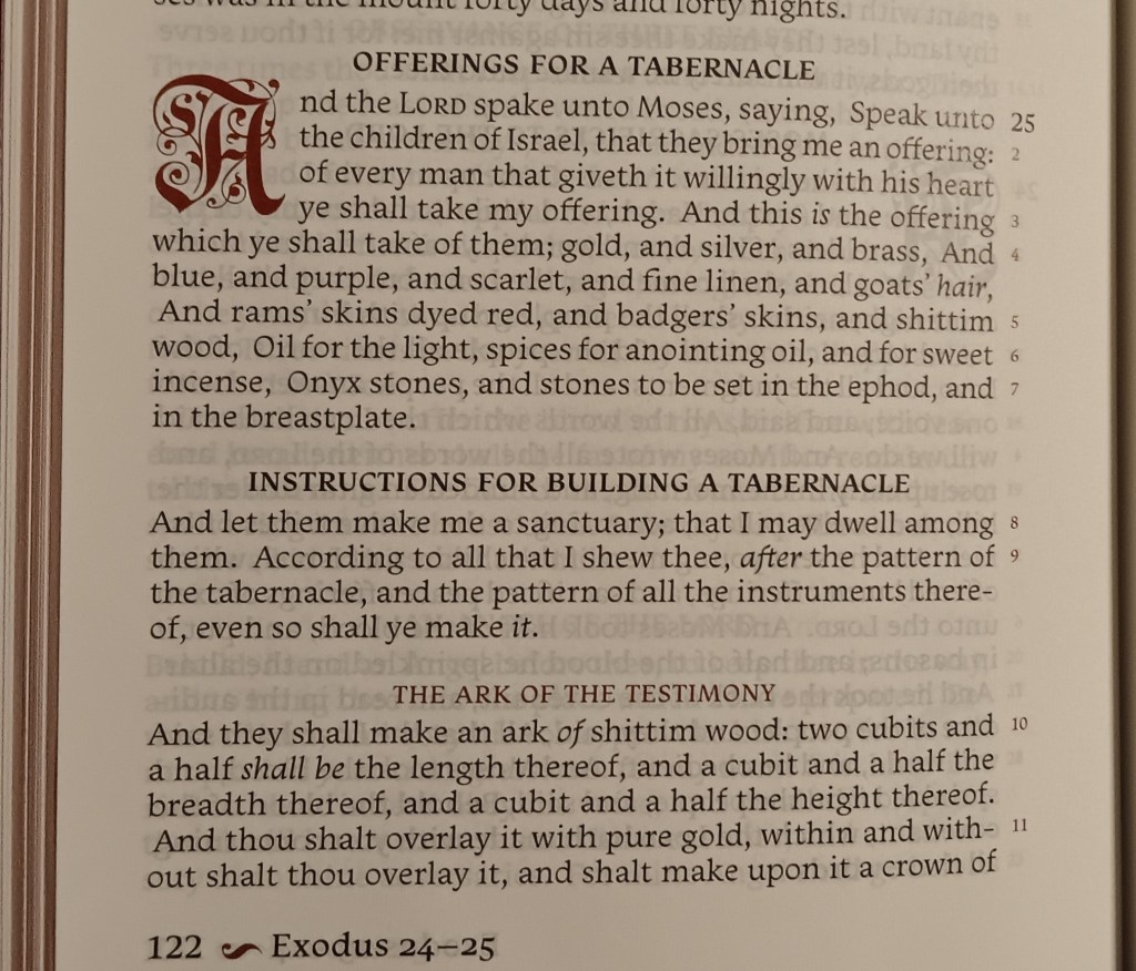
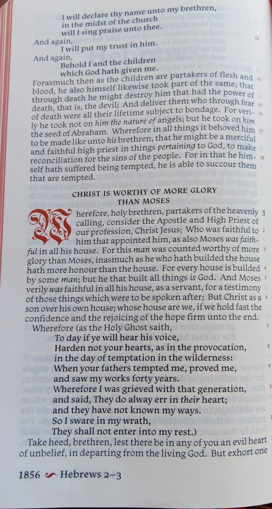
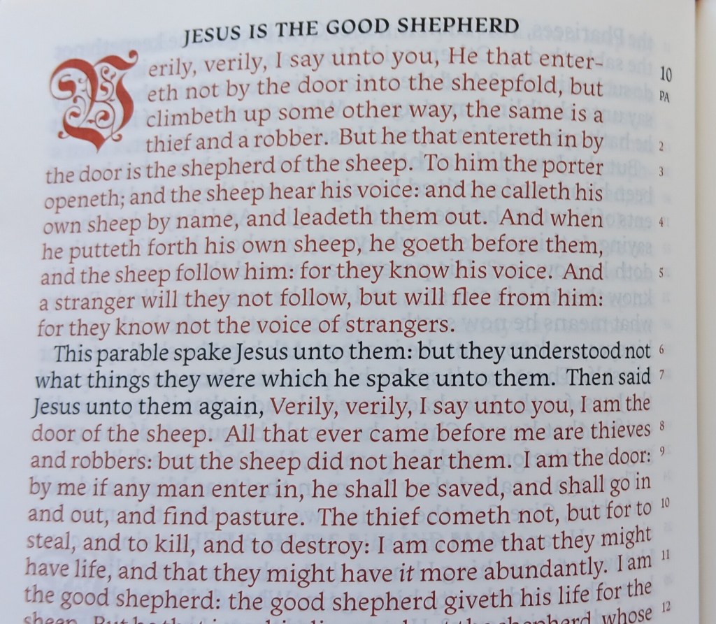
The text is set in a paragraph format with the verses set outside the text in the inner margins. So, it’s basically a verse-by-verse paragraph hybrid, which reads very well.
The layout of the single column measures: 7 1/8” x 3.75”
The page dimensions are: 8.5” x 5.25”
The overall dimensions with the yapp are: 10” x 6” X 1.75”
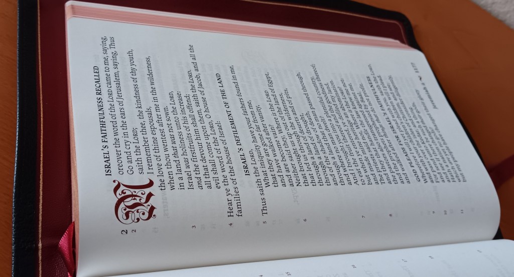
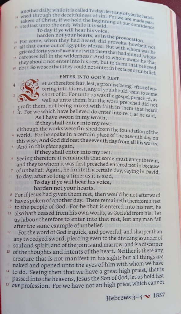
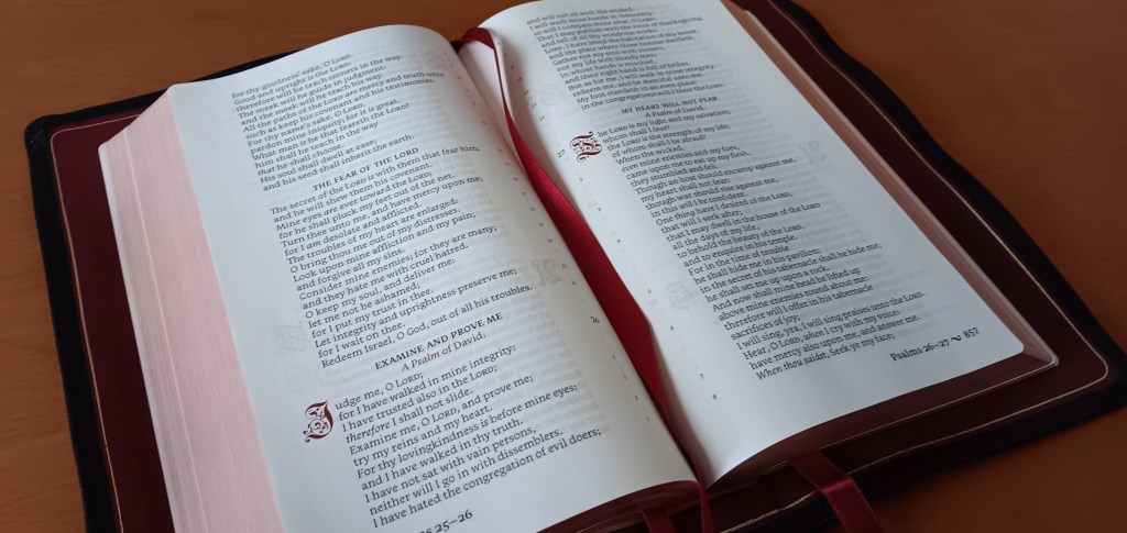
The paper used is 32gsm Primapaper and is milled in France. The paper is smooth and fine and the color is between a light ivory and eggshell, although there is some show through of the print. The beginning of the verse is distinguished by increased spacing where the verse begins and ends. The verse numbers are printed in red. The first verse in each chapter begins with a red decorative drop cap. If the drop caps cover three lines this indicates the first line is poetry, while all other drop caps cover 4 lines. The Section headings help break up the text and are printed in a darker black print that covers major sections, while the headings in red print cover more minor sections within the major sections. The text is set in an 11pt. typeface called Monarcha.
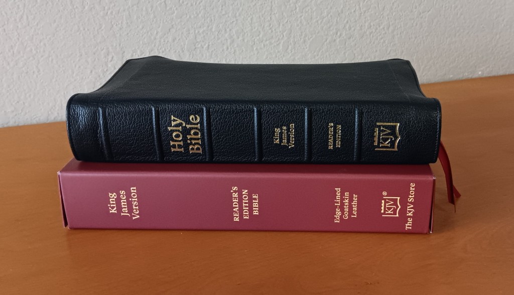
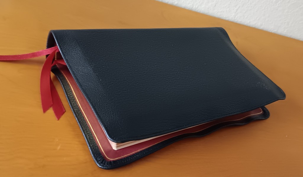
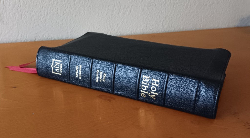
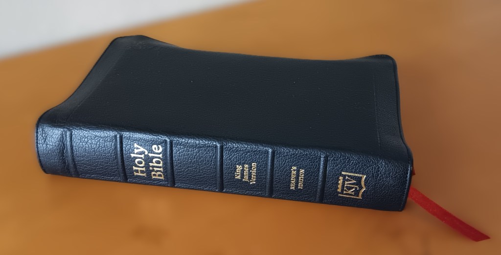
The text block is wrapped in black goatskin, it has a pronounced grain, and the cover is stitched around the perimeter. This binding is full yapp. The cover is a medium thickness and it’s soft and very flexible. The spine has raised hubs with gold stamping. The gold stamping is pronounced and stamped evenly.
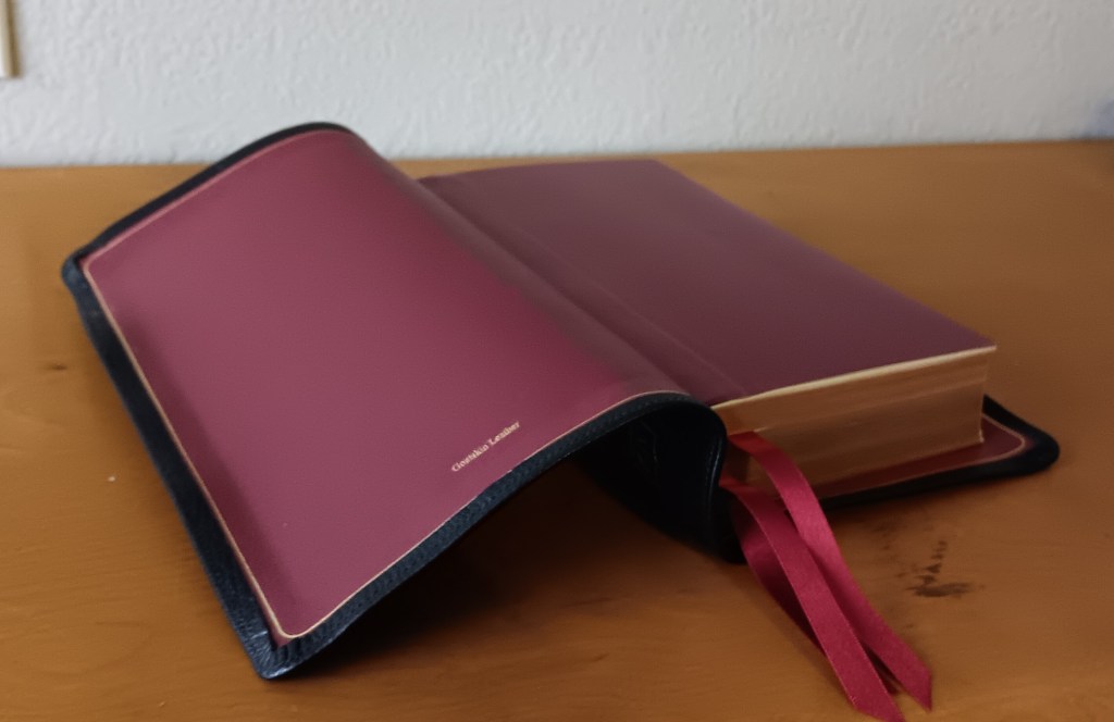
The bible is lined with a dark red split calfskin leather and a single gold gilt line circumferences the perimeter of the liner. The text block has red under gold page edges, and there are 3 red ribbon markers. The ribbons could stand to be a little longer.
The printing, binding, and overall construction is done by Jongbloed in the Netherlands, same as Cambridge Bibles and other premium editions.
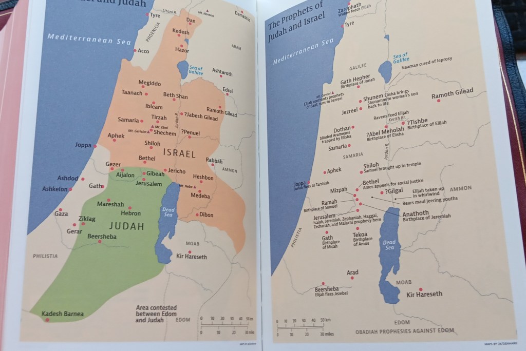
Included are 15 color maps printed on heavy stock matt finished paper. I think the paper in the maps could be made out of a lighter weight paper.
Some of the highlights are, with verse numbers set outside of the text you have a very reader friendly verse by verse setting. Besides using a standard book form layout throughout by utilizing the Sacred Syntax design techniques the text is broken up in an orderly fashion giving it a cascading effect, like a waterfall. Most Bibles have oversized chapter numbers, to the point of being garish, which to me is a distraction, but that’s not the case with this edition. With the KJV Store Readers the size of chapter numbers has been drastically reduced. The drop caps are very decorative and printed in red. I like the way the Old Testament quotes in the New Testament are also marked in the Old Testament, which is not something that is normally done.
My first impressions:
a) All the materials and construction are top of the line, and the leather feels great in the hand. The textblock is a great size to hold single-handed while reading. Although at times I do find the full yapp a little awkward while holding. While this goatskin is very soft and flexible some readers may prefer less yapp.
b) The drop caps are very decorative and printed in red, but at times it’s hard to identify the letter. The red print is not as readable as the black print because red is a lighter color than black, and being the font is a little thin this adds to the issue and may be a problem for some readers. In sections some of the red print can run a little long and as a result I would like to see some of the text broken up even more.
c) If the main text used a bolder font like the OT quotes this would further enhance the readability and using a heavier paper like a 36gsm the print would stand more off the page. The OT quotes could be set apart differently by using all caps or set them in poetry to distinguish them from the regular text.
Conclusion: I think the KJV Store’s Reader’s edition has one of the most innovative layouts since the Bibliotheca Project. I find that this design makes the text more attractive and more engaging. I can see this design being used for multiple editions, such as a single volume larger print edition or even a multivolume set with heavier paper. With a larger edition the margins could be increased, which would give the layout better presentation. With a multivolume set the editors could expand the parameters of their Sacred Syntax system. There’s a lot of potential with many possibilities.
This Bible can be purchased here: The King James Store

Leave a comment