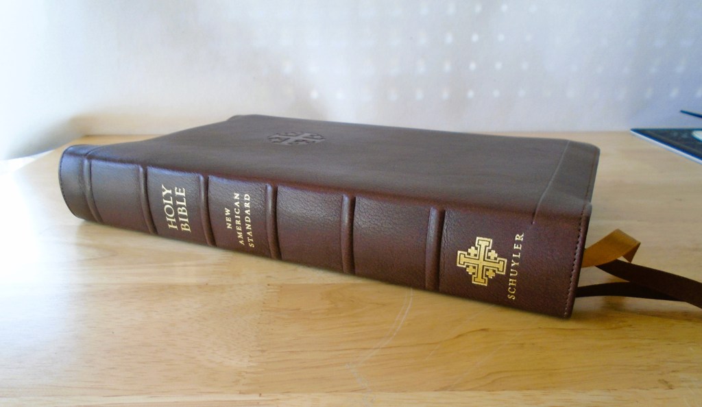
The edition being reviewed is the Schuyler Stridon NASB 2020 Reference edition. This is the Marbled Brown Calfskin full Yapp edition. The layout is a verse-by-verse single column with the 95,000 full reference suite including notes at the bottom of the page.

This marbled Calfskin is relatively smooth in appearance and feel, and the marbling on my edition is not very pronounced. It has a leather liner with perimeter stitching. This is a true full yapp, in other words, all ends of the cover can be made to touch. Right out of the box, the leather feels kind of rubbery for lack of a better description. It doesn’t have the same feel as some goatskin leathers, although it should soften and become more malleable with use.

This edition has a unique layout, it’s a single-column layout set in verse by verse. This layout is a joint project between the Lockman Foundation and Schuyler Bibles.

This edition offers excellent readability, allowing me to progress through the text more quickly compared to a standard verse-by-verse two-column layout. This effect is somewhat illusionary as the layout reads more like a paragraph than a traditional verse-by-verse format. However, it remains a true verse-by-verse edition, with each verse clearly set on its own line, while paragraphs are indicated by a darker and bolder number or letter that signifies where the paragraph begins. The Sans Serif font in the Stridon is set at 10 pt. and printed on 28gsm paper specifically sourced from Jongbloed in the Netherlands.

The verse numbers are located on the left side of the text. Other than the subject headings there are no paragraph breaks, so the paragraphs are indicated using bolder verse numbers.

The references and textual notes are split into two columns at the bottom of the page. The references are always on the left with the notes set on the right. Locating the references at the bottom of the page allows for a cleaner-looking page while also giving more room in the margins for notes.

The outer margins are 1.5” and the inner margins are ¾”. Throughout the text the references are indicated by superscript letters and the notes are numbered.

The paper in the Stridon was printed in the Netherlands by Jongbloed. Royal Jongbloed is one of the premier Bible manufacturers in the world. They print and bind editions for Cambridge, R.L. Allan, Crossway, and Schuyler Bibles. These editions are handbound using natural grain leather, so each one is unique.

The paper is 28gsm and this paper is only available direct from Jongbloed. The paper is thin but opaque and it’s silky smooth. The paper is whiter than cream, similar to eggshell and the print is consistently dark and crisp. This is a two-color print edition with the text printed in black and red accents. As mentioned earlier, the print is 10pt in size and the references are approximately 7pt. I would have liked to have seen the references in a larger font, especially since there appears to be enough room at the bottom of the page to allow for a larger font.

If you’re not a reader of the NASB 2020, the Stridon is currently available in the ESV and the NKJV.


Leave a comment