Layout: This edition is set in a paragraph format using two columns of text. The font is listed as 10pt with the references being 7pt. It includes book introductions, and each book starts on a new page. It also includes subject headings throughout the text. The subject headings are printed in a larger darker print.

The page numbers are located at the center of the top, with the book and verse ranges printed to the side. The prose is set in paragraphs while the poetry is versified using a stanza format.

The height of the columns varies, the tallest around 7-7 ¼” tall by 2.5” wide. The margin spacing is ½” with the inside margin spacing around 7/16”.

This is a reference edition with the references set at the bottom of the page in a single column. There are 43,000 cross-references, and 22,000 textual notes are printed in italics. The notes also contain numerous word definitions for archaic words.

Page size: 9.25” x 6.25”

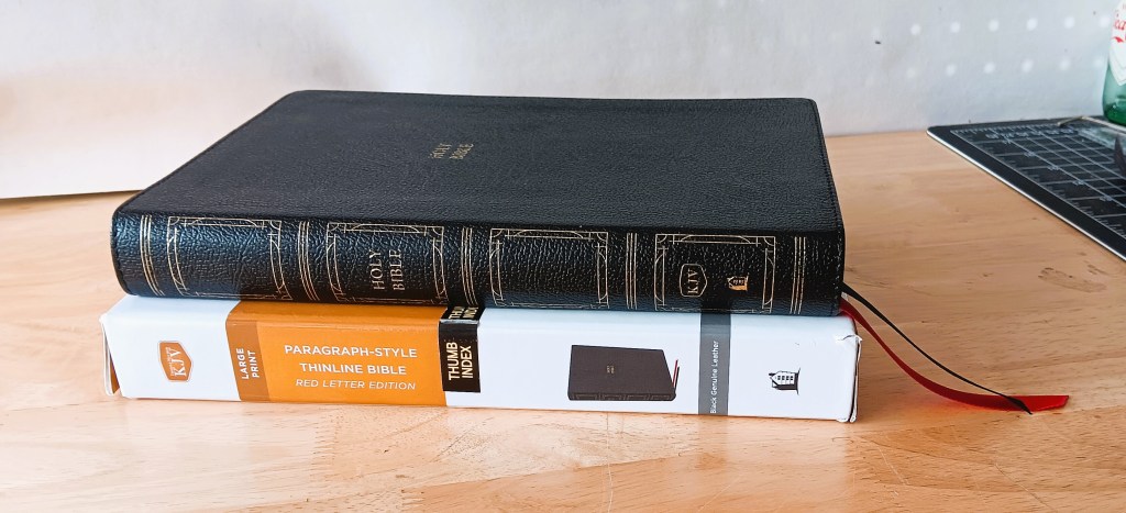
The outer measurements: 9.5” x 6.75” x 1.25”

The paper is nice and opaque, and I’m estimating the GSM is between 30-32gsm. The paper has a warmer shade with a slight cream appearance, so it’s not as bright as the 36gsm found in Nelson’s Premiere editions. The opacity is good, and better than many Bibles in this price range. This paper is also not as shiny as the paper found in the Premiere editions, and I’d say the paper feels softer and smoother than the 36gsm. However, the paper doesn’t feel overly delicate.

Print: The print in this edition is line-matched, it’s darkly printed and even throughout. The comfort print font is a bolder typeface, bolder than most fonts found in modern Bibles. This typeface was specifically designed for Thomas Nelson by 2K/ Denmark. The words of Christ are printed in red, and the print is redder than pink, but not as dark red as found in the Premiere editions.

Binding: This is listed as genuine leather. The leather feels flexible and mildly stiff, unlike pigskin and more like cowhide. The color is black with a shiny finish, and it has a stamped grain. It is paste-down constructed with vinyl liners and end sheets for the interior cover. The binding is stitched around the perimeter. The book block is Smythe-sewn and has overcast stitching at the front and the back of the book.

Exterior: The words Holy Bible are embossed in gold on the front cover and the spine. On the spine, there are 4 decorative boxes stamped in gold. In between the boxes are 5 faux hubs also stamped in gold. The gold foil on the page edges has been evenly applied. This edition has Index tabs with 4 books printed on each tab and is also available in non-indexed. There are two 10mm wide ribbons, about 3 inches long, one black for the OT, and one red for the New Testament.

Interior: A Presentation Page, Table of Contents, KJV Dedicatory page, Book Intros, 43,000 cross-references, 20,000+ textual notes, 92-page 3-column Concordance, Miracles of Jesus, Parables, a one-year reading plan, and 8 full-colored Bible Maps.

Recommend: I would like to see this Bible made available in a Premier edition with the premium binding, 36gsm paper, and the two-colored print. To better locate the verses, I would like to see the verse numbers printed in red. I find the subject headings too bold and obtrusive, and I’d like to see them made a little less conspicuous.

The leading in this edition appears to be standard, i.e., about the same size as the font. The leading needs to be larger or wider than the font, increasing it from 10 to 12pt. I would also like to see the margin spacing increased, and I would add additional space to the inside at the gutter, which currently measures about the same width as the ribbon, which is 10mm. I think at least 15mm is needed.

Comparison: For the lack of a better description, the KJV Paragraph is the unidentical twin of the NKJV Classic Verse Center Column edition. The difference is that the NKJV is versified while the KJV is a paragraph. The NKJV has center-column references while the KJV has references at the bottom of the page. Also, this layout allows for a thinner edition, the paragraph formatting and the wider columns take up less space, so there are about 200 fewer pages.

Conclusion: I like the layout in this edition, and it’s one of the better KJV Reference editions I currently own. The print is dark and bold which gives the print a larger presence. The paragraph formatting makes for a nice compromise between a reader and a reference edition. Also, the thinner profile makes it much easier to handle. With the numerous KJV Verse editions readily available, it’s nice to see a paragraph edition of this quality. If you’re looking for a KJV Thinline Reference edition, I don’t think you can do much better than the KJV Paragraph-Style Thinline.

Photo album: https://flic.kr/s/aHBqjBHrn1
Purchase here: CBD KJV Paragraph-Style Thinline Bible

Leave a comment