
The Lockman Foundation has always made a solid product, the handbound calfskin editions bound in the early 2000s by Abba of Mexico were something to behold. The editions bound between 1999 and 2003 are some of the most sought-after Bibles by collectors, not necessarily because of the binding, but as the result of the very opaque paper that Lockman used at that time, a paper which sadly is no longer available.

Shortly after that, most of Lockman’s products started to be printed and bound in China, not unlike most Bible publishers. Since the Abba bound editions, Lockman really hasn’t produced what many would define as a premium edition, and when I say premium, I’m referring to higher-grade materials not typically found on most mass-produced Bibles. Of course, with all of that said, the definition of premium Bibles has been redefined in the last three to four years.
Approximately four years ago, Thomas Nelson and Zondervan started to produce a premium line of Bibles called the Premiere Collection and someone had cleverly coined the term “Mid-Premiums” when describing these editions. The first editions offered a Goatskin binding, and these were leather-lined with gold stamped spine hubs, a sewn text block, and dark printing on opaque paper with red under gold art-gilt edges. The Premiere Collection made for an attractive edition at a more affordable price, in other words, challenging what had become the status quo in mass-produced Bible publishing.
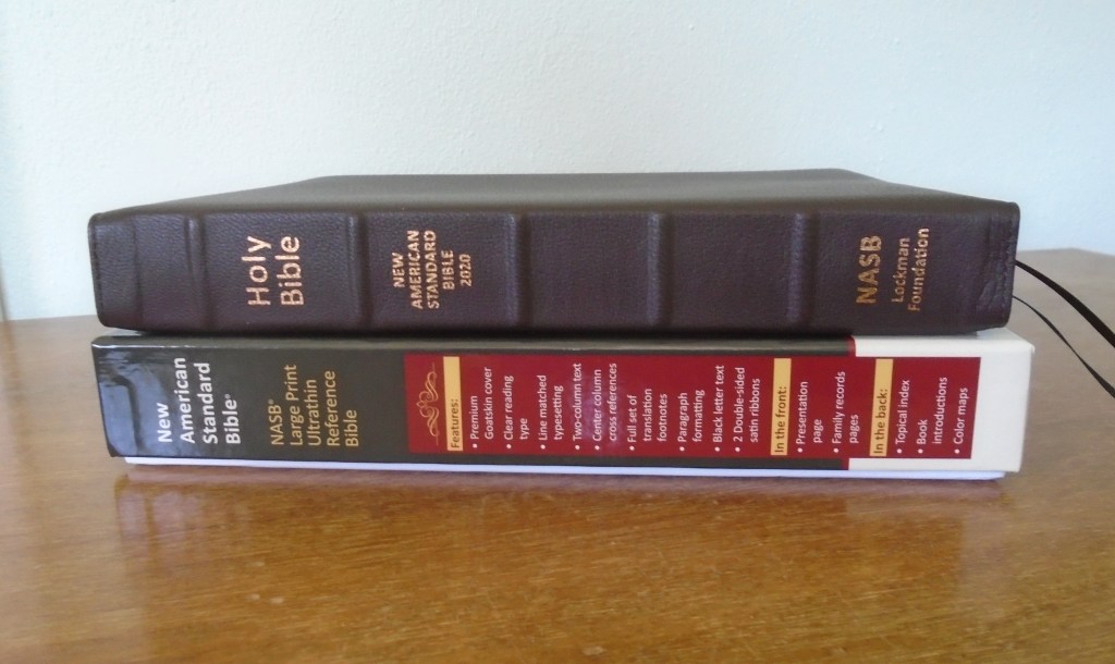
This brings us back to the Lockman Foundation, when many of us were concerned that Lockman were dragging their feet entering the premium Bible market, Lockman may have been playing it smart. To be fair, Lockman was rather busy at the time updating the NASB 95. While other Bible publishers like Schuyler and R.L. Allan were producing NASB 95 premium editions it seemed that Lockman had little or no interest in producing their own premium line of Bibles. Later, the NASB 2020 update was completed, and some newly designed editions were released in early 2020. These were all well-made attractive economical editions, and the top of the line was a black genuine leather edition along with some Leathertex editions in various colors. These were all pastedown editions, but a Calfskin 2020 LPUT edition was produced in 2021 which is an edge-lined edition. These LPUT editions were all Smythe sewn and printed in China on a blue-tinted paper. Late 2021, Lockman announced they would be releasing a line of premium editions called Prime editions, which brings us to April 2022, today, and to the review of the NASB 2020 Large Print Ultrathinline Prime Edition:

Binding: The Prime editions have a Goatskin outer binding with a leather liner, perimeter stitching, five raised spine hubs, and the color options for now are dark brown and black. The goatskin is very malleable, not too thick and not too thin, it has a good feel, not squishy as other Goatskin bindings that I’ve handled. This dark brown edition doesn’t have a high sheen, more of a flat tone. The cover has a little bit of yapp, about 5/16”. The five spine hubs are well done and strategically placed to allow room for the spine stamping.
Recommended: Tooling the hubs would add some flair to the binding and I would also add a little more yapp, at least 3/8” to 1/2”.

Construction: The binding is an edged line binding stitched around the perimeter. Inside the cover, the liners are leather and dark brown. The text block is Smythe sewn with overcast stitching in the front and in the back. The binding is solid and built well, and the perimeter stitching is clean with no visible loose threads. The corner work is well done, and the end pages are dark brown with the look and feel of vinyl. There are two blank white cardstock pages in the front and in the back. Overall, this edition lies a little flatter than most similarly bound editions and it feels solid and durable.

Internals: This edition includes the Old and New Testaments, a two-column paragraph layout with 95,000 center-column references with the full set of translation notes located at the bottom of the page. The font is approximately 11 pt., for quicker access the verse numbers are printed in a bolder font. In the front, there’s a Presentation page, pages for listing Marriages, Husband and Wife Family Trees, and Births and Deaths. The back matter includes a Topical Concordance, Parables, Miracles, and Events of Jesus, and full-colored Maps.

Layout, etc.: This edition has a two-column paragraph layout with center column references. It has 95,000 cross references with the full set of translation notes located at the bottom of the page. The main text is listed as an 11pt. font with an 11pt. leading. For quicker access the verse numbers are printed in a darker and bolder type. Each column is 2 1/4″ wide and there’s about seven words per line in the prose sections. The text is not cramped and there’s enough spacing between the lines of text allowing room for underlining. The reference material is accessible and readable making this one of the best two column reference editions I’ve used. The inner and outer margins are approximately 3/16″.

Recommended: Increasing the leading, (more space between the lines of text) would give the text a little more breathing room. Some notepaper in the back would have been a nice feature. I would also like to see some updated maps, nothing wrong with these, but I think the 2020 update deserves some newly designed maps.

Paper:
The LPUT Prime edition utilizes a 31gsm paper, this paper has an opacity rating of 85%. It’s a white paper, it’s about the same thickness as the paper found in the Chinese printed 2020 editions, but it’s more opaque and it doesn’t have a blue tint visible down the gutter. The paper also feels stiffer than the Chinese paper editions.

Recommended: The paper is listed as a premium European paper, but it may lack some brightness, for me, the color of the paper just doesn’t pop, it’s a bit flat. During a recent interview with Tim Nichols, the Vice President of Lockman mentioned paper availability as one of their biggest issues, and as a result, the next Prime edition will have a different paper with a slightly heavier weight.

Print: The Prime editions are printed in Korea. The print is line matched, and the shade of print is printed consistently throughout. This is a black letter only edition, which means the words of Christ are not printed in red, also no red accents.
Recommended: Some different colored accents would have been nice. The print could also be a little darker and this is where I think Lockman may have missed it just a little. Please don’t get me wrong about the print, I find it very readable, but if the print were a little darker, I think it might stand out off the page a little better. This is especially noticeable with the references in comparison with the Chinese printings, which are darker, but to be fair, some of this may have to do with the paper availability, and who’s to say Lockman didn’t look at different samples of print shades and they chose the better one? I also understand that this is a bit of a subjective issue, some people prefer a very dark bold print while others may not care much for the additional contrast or ghosting that a darker print may lead to, it’s a fine balance.

Decoration: Gold stamping on the spine, red under gold art-gilt on the page edges, a single gold edge line around the inside perimeter, and two double-sided satin ribbons. The gold stamping on the spine is clean and unobtrusive. The art-gilt is very well done, it’s a darker red, like a rose gold color, and it has been applied evenly. The single gold line inside the perimeter of the Bible is applied evenly. The ribbons are double-sided and are of good quality, brown and black for the brown edition.

Recommended: Although clear and readable, the spine stamping appears lightly stamped and may fade over time. The ribbons are cut a little short, also, most Bibles in this price range have three ribbons and since many people utilize a daily reading plan some extra ribbons would be very beneficial.


Dimensions: the outer measurements of the binding are 10” x 7. 1/16” x 1. 7/16”, the text block measurements: 9 ¼” x 6 ½” x 1 ¼”. The LPUT edition is about one inch wider than most large print thin line editions, giving it a more of a floppy “eagle” effect, (a phrase coined by an online Bible enthusiast).

In conclusion: as someone who has waited a long time for the Lockman Foundation to produce a premium NASB edition, I have to say, I’m impressed. I’ve owned numerous Bibles over the years, and this is one of the nicest Lockman Bibles that I’ve owned. The release of these Lockman editions takes me back to 2013 when R.L. Allan first had posted word of a joint venture with Jongbloed to print and bind Lockman’s NASB 95 LPUT edition, which they dubbed the NASB Reader’s edition. My thinking of the Allan editions at that time was, these are working Bibles, sturdy constructed Bibles that are made to be used and this is the same feeling I have with these new Lockman editions. If I were to rank the Prime editions, I’d list them somewhere between Thomas Nelson’s Premiere editions and the Allan Jongebloed bound editions. Basically, not as eloquent as the Jongebloed editions and just a little nicer than the Premiere editions. In short, Lockman really came through with the NASB 2020 Prime Edition, they’ve exceeded my expectations, and I’m looking forward to seeing more of their Prime editions in the future.
For purchase please click on the following links:
https://evangelicalbible.com/product-category/nasb/nasb-lockman/

Leave a comment