Several months ago I wrote a review for a Tyndale Bible called the NLT Slimline Center Column Reference edition and I just so happened to mention the lack of premium editions available in the New Living Translation. I concluded my review with the recommendation of upgrading the quality of the paper, print, and binding. Well, at the time of my review apparently Tyndale had already been working on a premium edition, and in my opinion, they hit a home run with their new Select Reference goatskin edition.

The layout of the Tyndale Select is a new setting that was designed in-house by Tyndale. The layout is very similar to the layout in the Cambridge Clarion edition. The setting in the Tyndale Select is in Paragraph format with the references set in the outer margins. The text is line matched, and the size and font of the main text is 8.75 Lexicon.

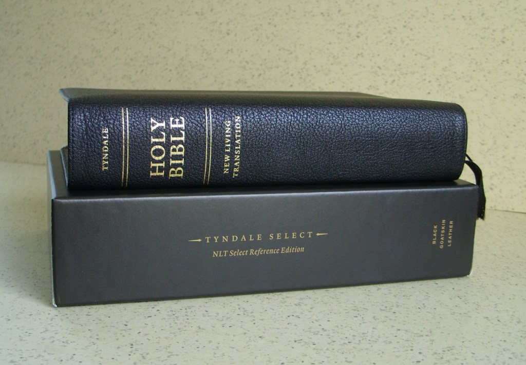
The Tyndale Select edition is constructed very similar to Cambridge’s Goatskin editions and for good reason. The printing and binding are done in the Netherlands by the same people who do the work for Cambridge and other premium Bible Publishers. In short, the NLT Select Goatskin edition is Cambridge quality from print, paper, and binding.

The Select Reference edition is a little larger than the Clarion, mainly about 1 inch taller and the overall dimensions are 8.25 x 5.25 x 1.75 inches. The differences in the layout are minor. Since the NLT Select is taller, Tyndale had more space to work with, and what you get is more space between the lines of text, more so in some instances than others, such as in the poetry sections. Also, throughout the text of the Select, there are no superscript reference letters, and the subject headings are set in a bolder font.

As much as I would like to continue a comparison with the Cambridge Clarion, I’ll instead compare it with the Tyndale Bibles that I’ve reviewed or mentioned previously. As I mentioned in my previous Tyndale review, there was a lack of premium editions available in the NLT Translation, that is until now. In the following pictorial comparisons, I’ll attempt to show how Tyndale has improved in the areas of print, paper, and binding.
The print is in black-letter only and is consistently dark throughout. Even though the font size is 8.75 it sizes up quite well to the 10/11 pt. font in Tyndale’s Large Print slimline editions. And I find the line matching of the text makes the Select more readable. The line matching reduces the shadowy graying effect on the paper caused by the print from the other side of the page.

As a result, more white space is created, and this causes the print to stand out more off of the page. The paper in the Select also looks opaquer, and a reliable source informed me the paper is Indopaque 28gsm and the opacity rating is 79%. I’m sure Tyndale could have selected an opaquer paper, but at almost 2,200 pages, the heavier paper would have produced a much bulkier Bible.

The outside binding of the Select is perimeter stitched and is made of a natural goatskin hide that is very flexible. The grain of the hide appears natural, and it has a pebbly texture. Overall, it has a very nice appearance and feels great in the hand.

The liners are made from a very shiny and smooth synthetic material that gives the impression of plastic; however, it is very flexible. The liners in the Select run under the edges of the outer binding where it wraps around to the inside of the cover. The liner also runs about one inch between two end sheets that are glued together creating a stiff hinge and a very durable bond to the text block. The reason for the synthetic liners and the stiff hinge construction is to enhance durability and longevity.

The Select has the same Concordance and maps that are in Tyndale’s other editions. The only difference being the concordance in the Select uses a larger font, and besides three columns, the concordance in the Select has a two-column layout. There are eight maps and besides using glossy paper for the maps, the Select uses a very nice matte finished paper.

With the new Select edition Tyndale has provided an edition with premium paper, print, and binding, however, they exceeded those demands with a brand-new layout. I’ve had the Tyndale Select for a few weeks now and what I can say is, the more I handle it and read it, the more I like it.

I don’t have much to recommend in the way of improvements for this edition, except for maybe some lined note paper in the back and just for aesthetics, I would like to see about four to five raised hubs on the spine instead of the two faux gold stamped ones. Also, in the future, I would like to see an edition with a little more yapp and I would also like to see a Tyndale Select two column Thinline reference edition.

You can purchase the Tyndale Select in Black or Brown goatskin with or without index tabs. The Select is also available in a more economical Calfskin edition in black or brown and also with or without index tabs. If you can afford the Goatskin edition, then for the money I think the Goatskin edition would be the better buy.
*As of 2022 the Select edition is no longer available.

Leave a comment